Dashboard design for the portal optimizing the patient’s and clinician’s experience
Foresight, a mental health clinic in Berkeley, CA, is dedicated to leveraging technology to improve mental healthcare and lifestyle. Foresight employs a software-as-a-service (SaaS) prescription platform for psychiatrists to keep track of all patient information and provides advanced algorithms to deliver highly personalized, data-backed treatment plans to each patient.
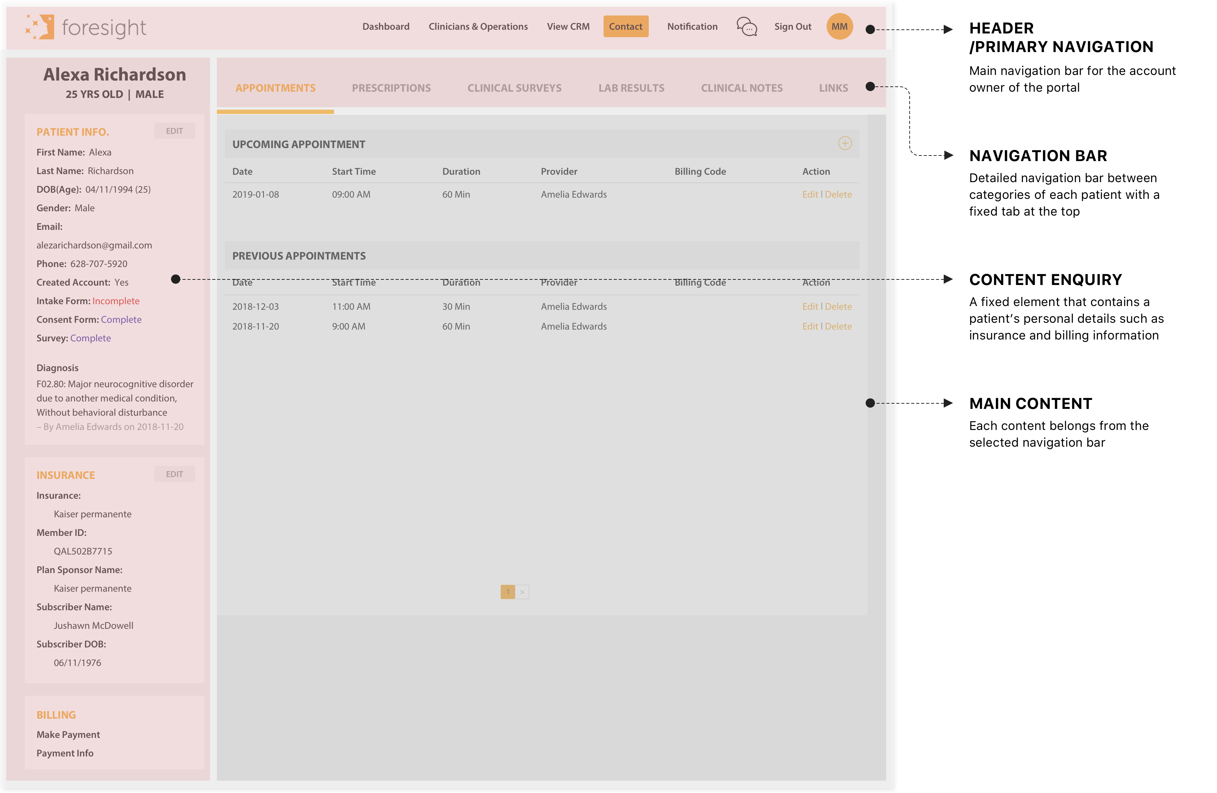
To revolutionize mental healthcare, a dashboard is one of the company's most important assets. It connects the core values of the company. The primary goal is to get the message at a glance. It is a simple view to present all information and guide users in summarizing the contents.
Target users are psychiatrists, therapists, and operations. They mainly use this product to check the patient’s information, status, and progress and to prescribe medications.
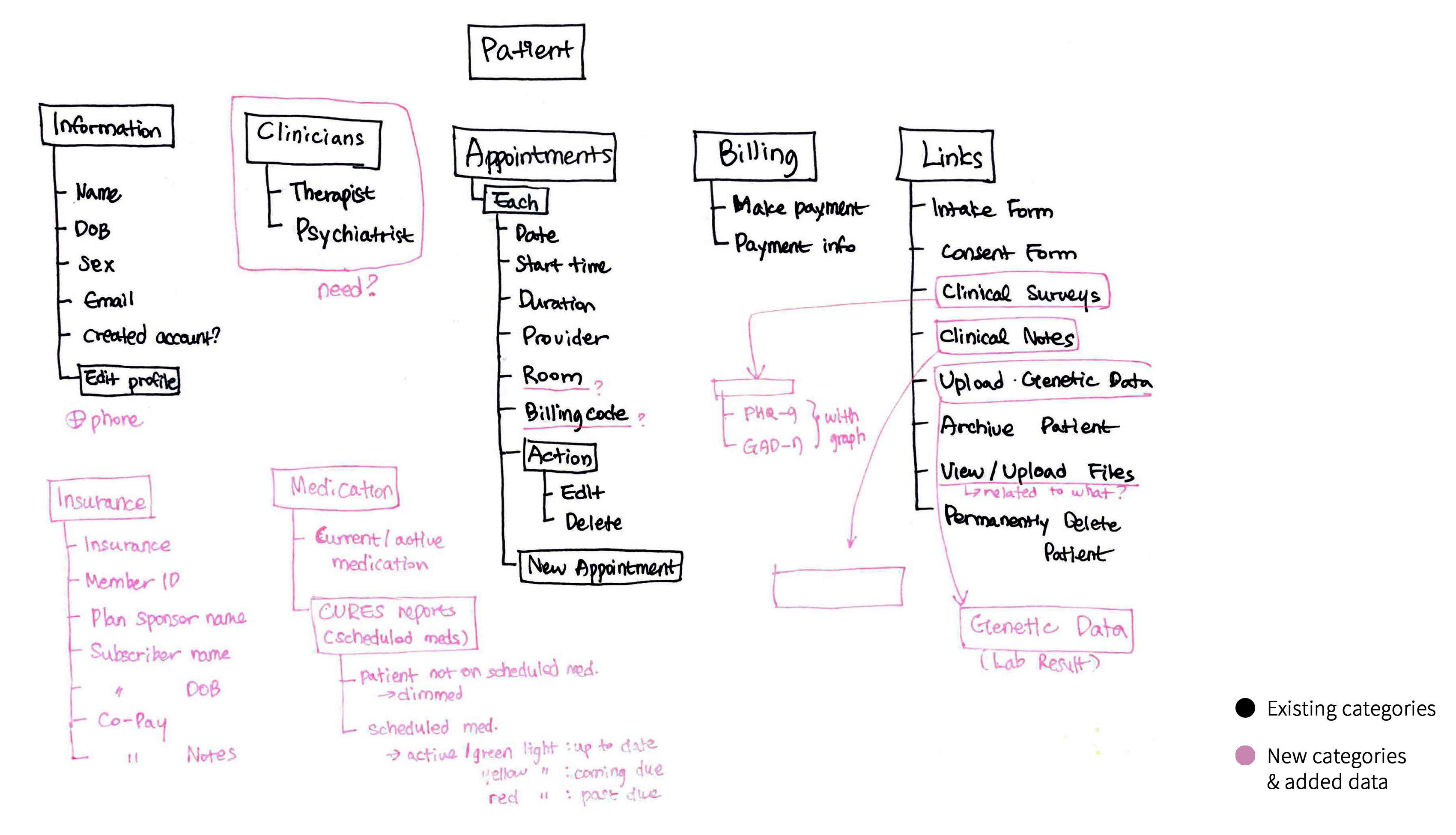
At the outset of the project, I didn’t have a clear mission or specific goals for dashboard design. Before I jumped into the design, defining success and understanding the challenges were critical. I started by picking up the pieces from the existing structure that caused problems and difficulties. Next, I collected the issues with engineers, clinicians, and operations in the most problematic uses. My goal was to understand the challenges users faced and the workarounds they employed. I started to question myself followings:
Identified the following core problems :
DEFINE THE PURPOSE OF THE DASHBOARD
After the inquiries, it became clearer that it was important for users to have access with minimal effort. In addition, as the dashboard became more integral to clinicians and operations, their expectations evolved.
by one of the providers at the clinic
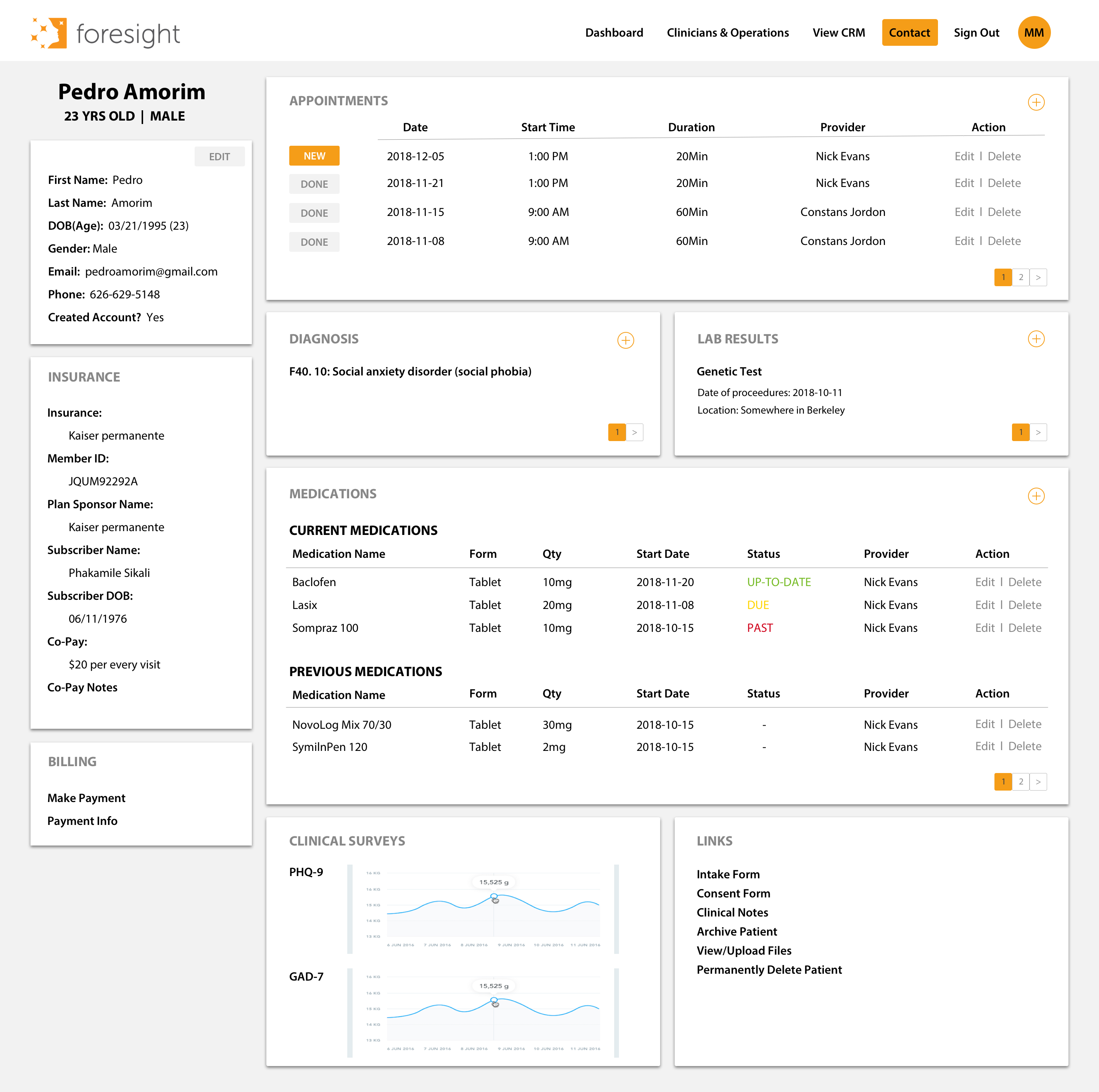
The project's goal was to create a dashboard for innovation and deeper engagement that embraced a rapidly evolving business and a more efficient use base. The dashboard is an at-a-glance preview of crucial information for the users when looking at it. It is an easy way to navigate directly to various areas of the application that require users' attention; every little thing counts.
To provide the user with support to react and take action, I set the dashboard's purpose as a mixture of an Operational and Analytical dashboard. The primary goals of an operational dashboard are to present data deviations to the user quickly and clearly and to show current resources and their status. And an analytical dashboard aims to help users make the best sense of the data, analyze trends and drive decision making.
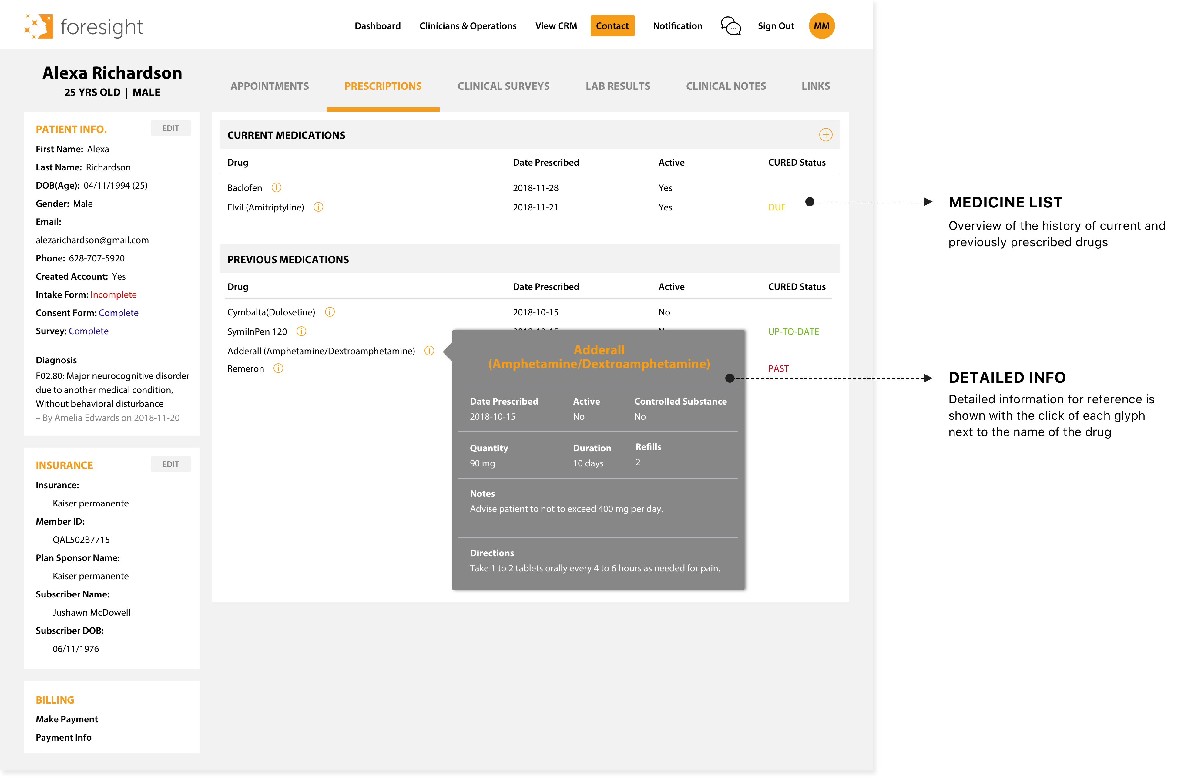
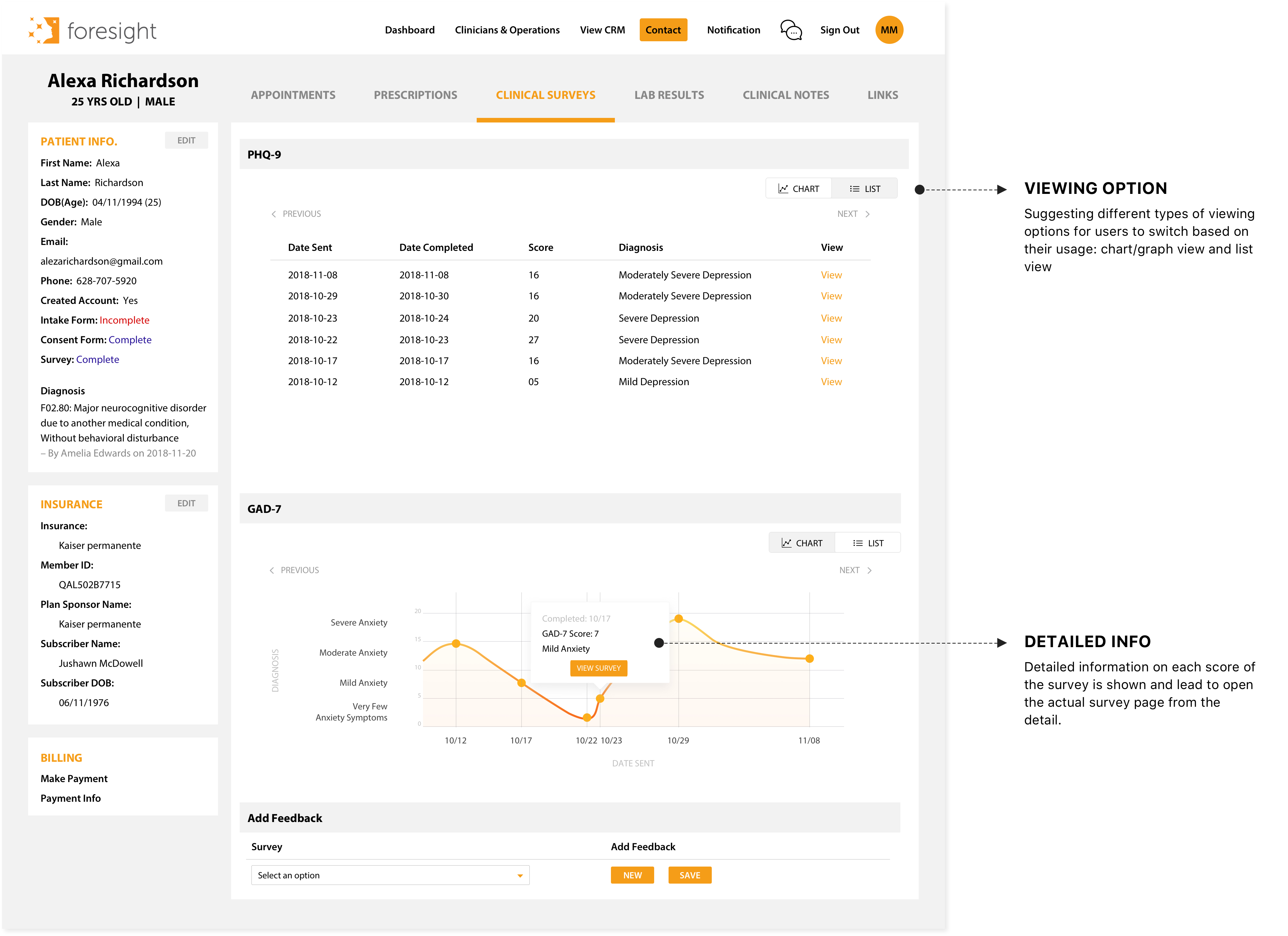
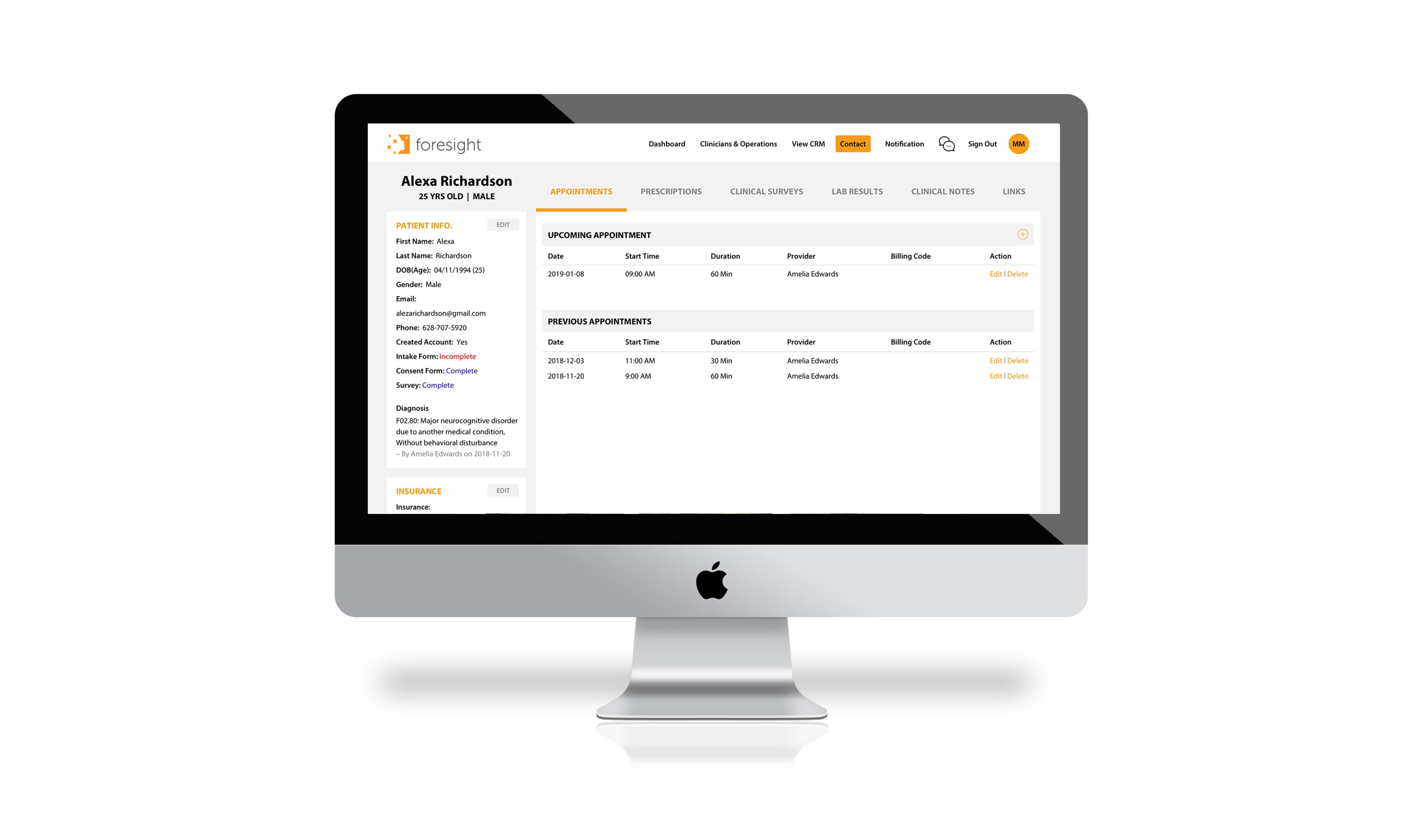
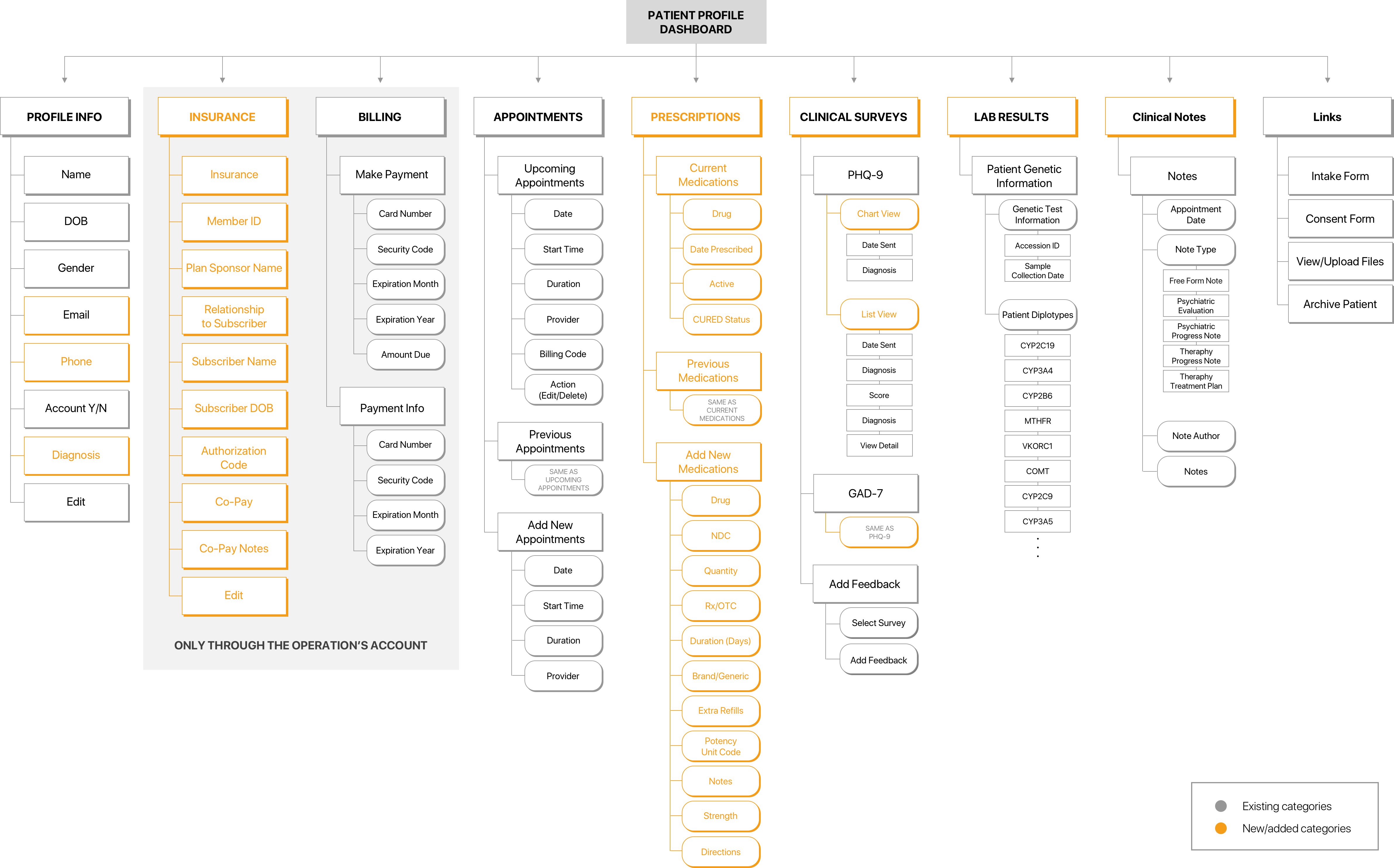
The priority based on the discoveries and inquiries was to sort out the essential elements brought forward in the hierarchy without distractions. For example, I made a separate tab for Clinical Survey, not under the Links to provide a more straightforward approach and understand the current medication for users to determine what drugs are the most effective for patients.
DEFINE THE LAYOUT. FLOW. PRIORITY
Grids help to achieve effective alignment and consistency with little effort. I started by creating a basic structure and a skeleton for the design. Even though they are invisible, they tie together in an overall ’system’ and support the composition in which my design elements can be placed. They help me to organize a ton of information seamlessly. I tried different types of layouts for the overview screen. Each design follows essential components and priorities but has its own layout and user flow.
As one of the primary goals of the dashboard is to surface information at a glance, relying on scrolling or many interactions dilutes the whole purpose. So, when making decisions on what information should go where and what layout to follow, I made a decision based on:
❌ Problem of design #1 - Cardstack
Even Cards or multiple widgets have the benefits that they are almost infinitely manipulatable and a good option for responsive design. However, if it’s over 7 widgets, it is hard for the user to focus and get a clear overview.
❌ Problem of #3 design - Left to right
It has a similar pattern as #2, but it has limited space for the main contents to show when it comes to the left to right flow.
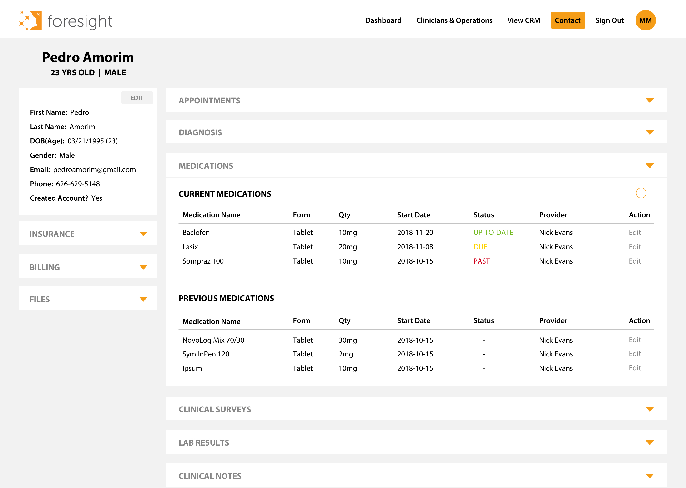
❌ Problem of #4 design - Dropdown
It is a condensed version of #1. Users can search for information based on each tab, but it eventually reaches a long scrollable dashboard. It is good to display more information in one overview, but it could overwhelm the users. And this leads users to fold the screen to discover other information, and everything below the screen gets little attention.
We finalized the second dashboard layout from the 1st iteration. The solution is to prioritize the core information. Don’t tell the whole story, but summarize and surface only essential information. And do not overwhelm the user.
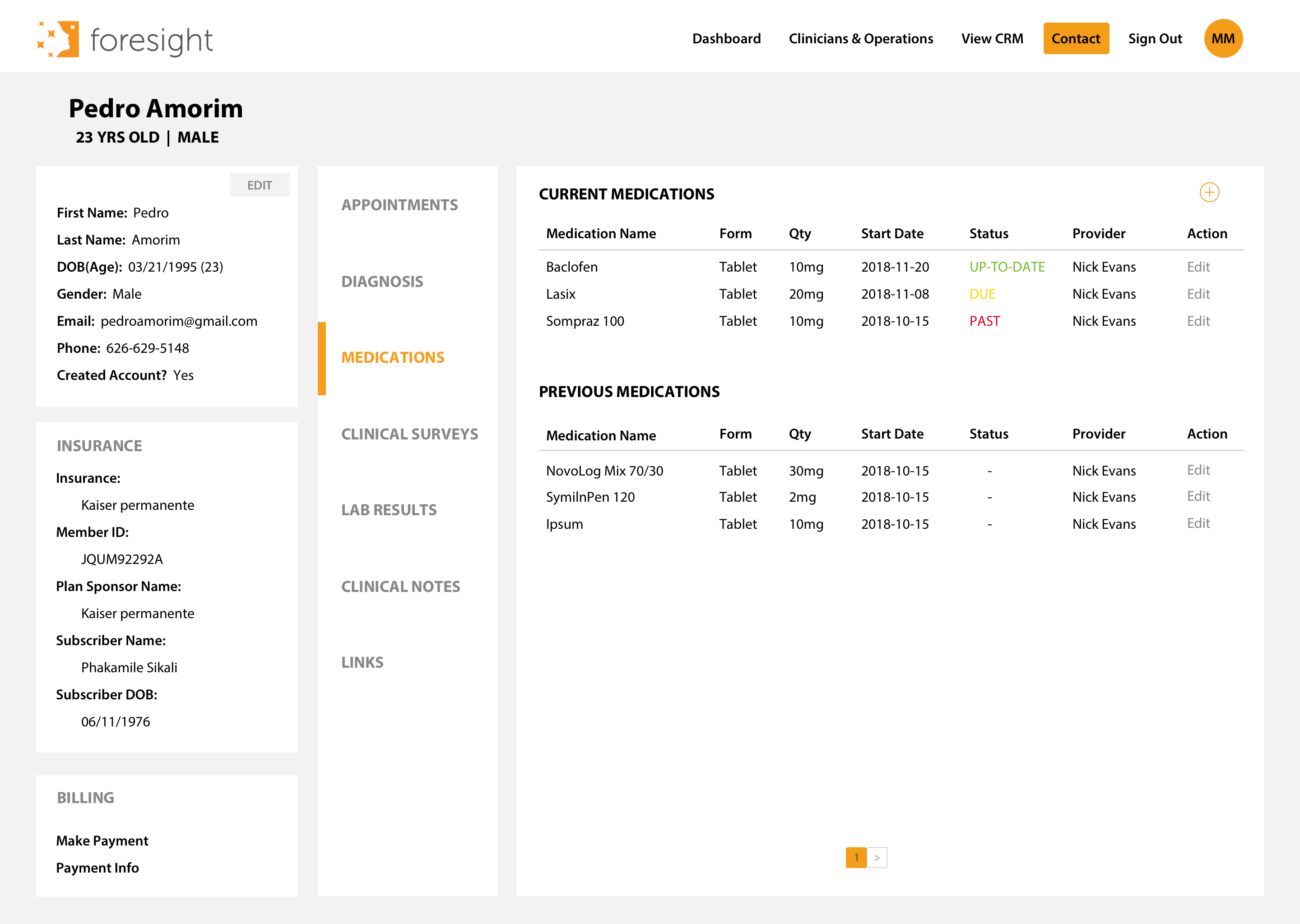
One of the most beneficial features of the design is the categorized menu is on the top within one row. This helps users browse an overview of each category easier with smooth eye flow — the #2 design compromises all the negatives from other designs mentioned above. Also, when users open one of the categories, it allows more space to contain information, maximizing screen use while allowing easier navigation. All these design benefits allow us to move forward with the second design.